
Have you had issues with font-size? 🤔 Did you even know there are some unit of measurements when it come to font size? 🤔. Have you been hooked using px for font sizes? 🤔.
If yes! then this article is for you. Relax and let's embark on this little journey.
What is px?
‘px’ as far as CSS authoring is concerned is : a ‘px’ is the quantity of length equal to the pixel in an unscaled HTML.
😮 just knowing this right? let's move on
px and responsive typography
We are in the era is responsive web designs. All components of your website must be responsive (up to your fonts) because users mostly spend most of their time on mobile phones.
👉 px is relative to the DPI and resolution of the viewing device.
Which means that no matter how smaller or bigger the screens 'px' value will always be the same and this is against the rule of Responsive typography But there are some texts on your site that doesn't need to reduce or increase across screen sizes, in that regard you can go for 'PX'.
🤔 If px is against the rule of responsive designs then what can I do?
Very Simple!!
You Either go for Rem or Em.
Rem and responsive typography
Rem is very good when talking about responsive text. Rem is relative to the root element , which means that the determinant of its font size is the root element font size
🤔 Root element???
Root element the the html tag itself
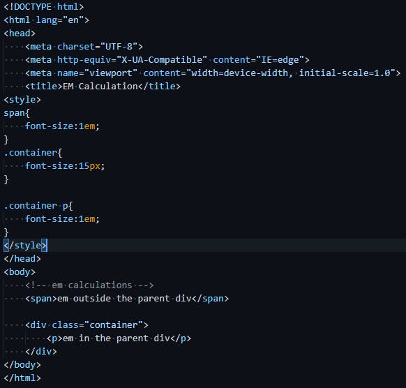
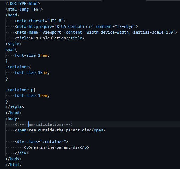
<!-- Root Element -->
<html>
</html>
Some browsers set the font-size of the root element to 16px Which implies that 1rem = 16px
😮 just knowing this right? let's move on to practical example
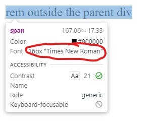
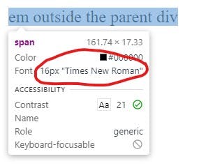
 👉 font size of the span element = 16px (when inspected on the browser).
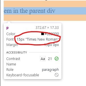
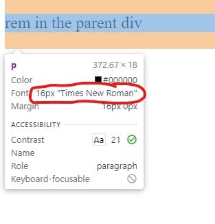
👉 font size of the paragraph element = 16px (when inspected on the browser).
The font size of and element will always be 16px because the font-size of root element is 16px by default. Rem is also good when talking about responsive text. Em Relative to the parent element, which means that the determinant of its font size is the parent element font size. 😮 just knowing this right? let's move on to practical example. 👉 font size of the span element = 16px (when inspected on the browser). 👉 font size of the paragraph element = 15px (when inspected on the browser). The font size of and element is different because the element is sharing the root element font size while the element is sharing the container element font size. Thanks for reading till the end 🙏.
Did you enjoy the ride 🏍? If yes please Like, Comment and share this article, This will motivate me to do more. Let's meet in the next article ✌✌Em and responsive typography