How to replace bootstrap accordion icon

Frontend Web Developer | Freelancer | Web Facilitator @PHA && Proxy Coding School | TechBroda
Before going into depth in this article you should be familiar with bootstrap for a better experience. If yes! you can move on, If No! click here to know more about bootstrap
I'm currently working on a project that has an FAQ page and am of greater advantage using bootstrap (UI framework). so I decided to use one of Bootstrap's components called Accordion. You can also make use of it by clicking here.
Copying and pasting is not the problem you know, the main problem is to know how to manipulate what you are pasting.
I faced one challenge that I need to conquer: the bootstrap accordion caret icon. I already have a design that I want to translate into a website, plus icon is used in the design and I'm to replicate the same design.
Thank God I was able to accomplish the task and delivered it successfully for my client. I'm ready to give you a step-by-step method on how I solve this issue.
Now let's ride together!

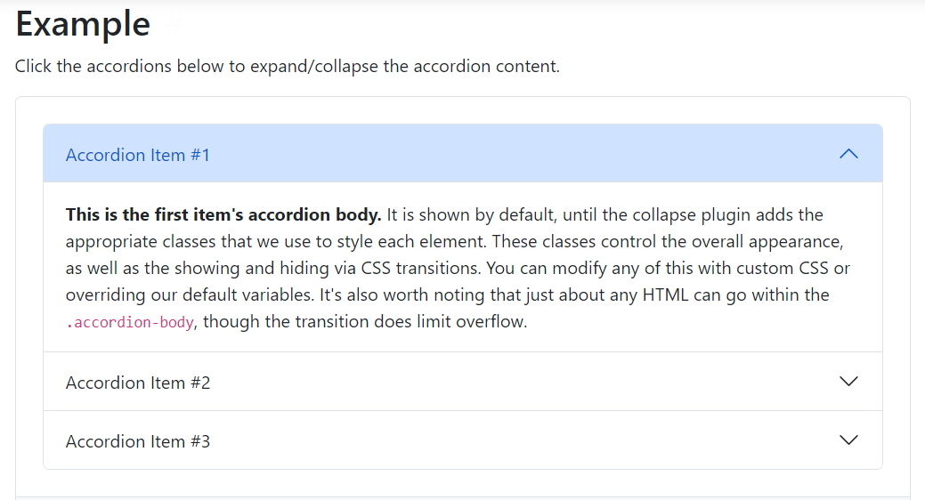
First, you need to copy the Bootstrap Accordion component here and you should have this 👇👇👇
<div class="accordion" id="accordionExample">
  <div class="accordion-item">
    <h2 class="accordion-header" id="headingOne">
      <button class="accordion-button" type="button" data-bs-toggle="collapse" data-bs-target="#collapseOne" aria-expanded="true" aria-controls="collapseOne">
        Accordion Item #1
      </button>
    </h2>
    <div id="collapseOne" class="accordion-collapse collapse show" aria-labelledby="headingOne" data-bs-parent="#accordionExample">
      <div class="accordion-body">
        <strong>This is the first item's accordion body.</strong> It is shown by default, until the collapse plugin adds the appropriate classes that we use to style each element. These classes control the overall appearance, as well as the showing and hiding via CSS transitions. You can modify any of this with custom CSS or overriding our default variables. It's also worth noting that just about any HTML can go within the <code>.accordion-body</code>, though the transition does limit overflow.
      </div>
    </div>
  </div>
  <div class="accordion-item">
    <h2 class="accordion-header" id="headingTwo">
      <button class="accordion-button collapsed" type="button" data-bs-toggle="collapse" data-bs-target="#collapseTwo" aria-expanded="false" aria-controls="collapseTwo">
        Accordion Item #2
      </button>
    </h2>
    <div id="collapseTwo" class="accordion-collapse collapse" aria-labelledby="headingTwo" data-bs-parent="#accordionExample">
      <div class="accordion-body">
        <strong>This is the second item's accordion body.</strong> It is hidden by default, until the collapse plugin adds the appropriate classes that we use to style each element. These classes control the overall appearance, as well as the showing and hiding via CSS transitions. You can modify any of this with custom CSS or overriding our default variables. It's also worth noting that just about any HTML can go within the <code>.accordion-body</code>, though the transition does limit overflow.
      </div>
    </div>
  </div>
  <div class="accordion-item">
    <h2 class="accordion-header" id="headingThree">
      <button class="accordion-button collapsed" type="button" data-bs-toggle="collapse" data-bs-target="#collapseThree" aria-expanded="false" aria-controls="collapseThree">
        Accordion Item #3
      </button>
    </h2>
    <div id="collapseThree" class="accordion-collapse collapse" aria-labelledby="headingThree" data-bs-parent="#accordionExample">
      <div class="accordion-body">
        <strong>This is the third item's accordion body.</strong> It is hidden by default, until the collapse plugin adds the appropriate classes that we use to style each element. These classes control the overall appearance, as well as the showing and hiding via CSS transitions. You can modify any of this with custom CSS or overriding our default variables. It's also worth noting that just about any HTML can go within the <code>.accordion-body</code>, though the transition does limit overflow.
      </div>
    </div>
  </div>
</div>
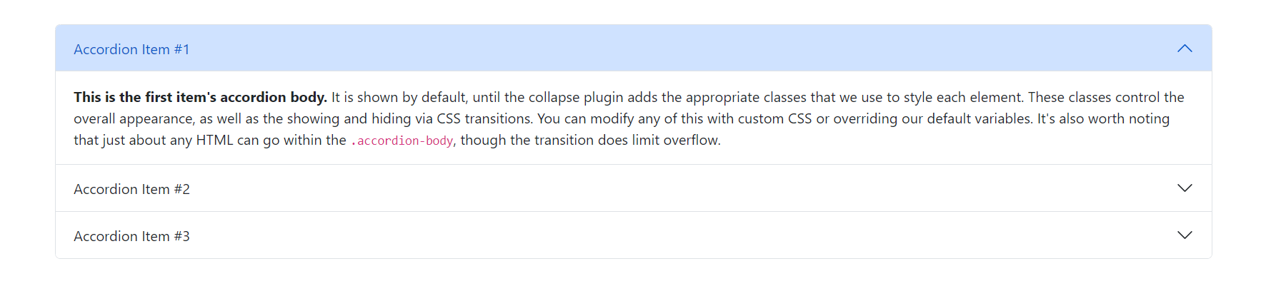
Then your output should be this 👇👇
I will show you what is happening behind the scene (Your browser's dev tools)
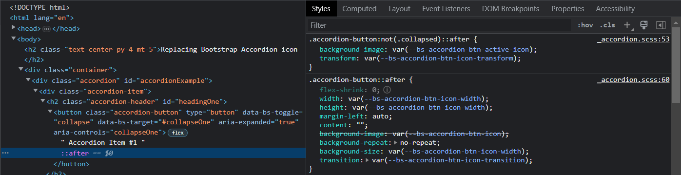
Do you see what I saw 😯. .accordion-button:not(.collapsed)::after{} is the one responsible for the icon. The question now is how can I override this thing.
Panic no more! I'm here for you. Let's move on, we need to write our styling to override it.
Click here to watch out for the concluding Part


